The Problem with Float Labels
The float label was introduced as a new type of form interaction pattern by Matt D Smith. The design pattern quickly gained popularity and became widely used on the web, but was mostly used in mobile designs.
Before the float label design, form inputs typically displayed the label above or beside the input field. The thinking was that putting labels to the left or above the input took up valuable real estate and made it more difficult for users to remember what information is required for the form.
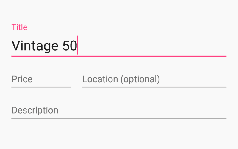
The float label intended to solve those problems by displaying the label inside the input field, and animating it to "float" above the input field when the user types in it or focuses on it.
Adoption by Google
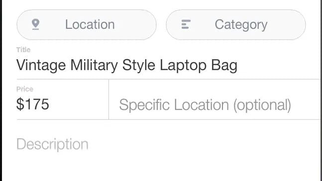
In 2014, Google adopted the float label pattern for the Material Design language. Their goal was to "mimic the feel of pen and paper." At a time when Apple was pushing for skeuomorphism and Microsoft was making everything flat squares, Google found a happy medium.
Looking at the design of the form, it's clear where its inspiration came from. When filling out a form physically, there is a line that you write in. Boxes aren't used because, well people's handwriting sucks.
The design of the form seems simple, but are there any issues with it?
The issues
Placeholders
Nielsen Norman has done some research on issues they have found with placeholders and form inputs. While float labels solve the issue of disappearing labels when people used to rely only on placeholders as their labels, they still look like input filled in when doing a quick scan of a form.
The other issue Nielsen Norman found is that inputs can sometimes look like data that was pre-filled, like a billing address being auto-populated because the shipping address is the same.
No good space for hint text
Libraries that use float labels typically have the help text appear in different ways. Some place them as tooltips next to the label. Material puts hint text underneath the form input. Both of these solutions are problematic. Tooltips as help text is a strange experience and should be avoided. Tooltips should be keyboard accessible and having to tab into a tooltip breaks up the float of filling out information. If you're including information that helps users to fill out the form, let them see it!
Material and a few others place their help text under the input. However, this can be problematic. What typically happens when an error message appears is that the help text gets replaced with the error message. What happens if you don't enter anything into the input? The error message might say, "Enter your phone number," but what's the format of the phone number needed? The other issue brought up by Adrian Roselli is that the help text also gets covered by autocomplete.
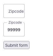
No appropriately sized inputs
Appropriately sized inputs give users an affordance that only a certain number of characters are required to enter, for example, a zip code field that has a small width fitting 5 characters. In the case of float labels, we need to size the field to 8 characters, or possibly more, to work with the width of the label.
Conclusion
While the float label design pattern has become widely used and popular in web and mobile design, it isn't without its problems. While these issues may not be considered to be deal breakers for everyone, it's important to be aware of the issues that may come up with using them.